Gallery Leaf
<time datetime="2023-06-24 03:00:00 +0000 UTC">June 24 2023</time><span class="px-2 text-primary-500">·</span><time datetime="2024-02-20 16:00:25 -0600 CST">Updated: February 20 2024</time><span class="px-2 text-primary-500">·</span><span>213 words</span><span class="px-2 text-primary-500">·</span><span title="Reading time">1 min</span>
Blowfish
Shortcodes
Gallery

🐡 Shortcodes
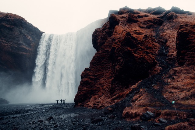
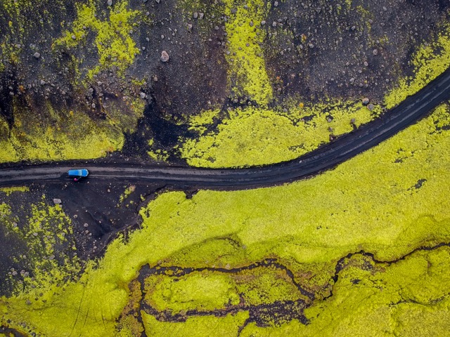
gallery allows you to showcase multiple images at once
gallery allows you to showcase multiple images at once, in a responsive manner with more varied and interesting layouts.
In order to add images to the gallery, use img tags for each image and add class="grid-wXX" in order for the gallery to be able to identify the column width for each image. The widths available by default start at 10% and go all the way to 100% in 5% increments. For example, to set the width to 65%, set the class to grid-w65. Additionally, widths for 33% and 66% are also available in order to build galleries with 3 cols. You can also leverage tailwind’s responsive indicators to have a reponsive grid.
Example 1: normal gallery
{{< gallery >}}
<img src="/snippits/blowfish/shortcodes/gallery/01.jpg" class="grid-w33" />
<img src="/snippits/blowfish/shortcodes/gallery/02.jpg" class="grid-w33" />
<img src="/snippits/blowfish/shortcodes/gallery/03.jpg" class="grid-w33" />
<img src="/snippits/blowfish/shortcodes/gallery/04.jpg" class="grid-w33" />
<img src="/snippits/blowfish/shortcodes/gallery/05.jpg" class="grid-w33" />
<img src="/snippits/blowfish/shortcodes/gallery/06.jpg" class="grid-w33" />
<img src="/snippits/blowfish/shortcodes/gallery/07.jpg" class="grid-w33" />
{{< /gallery >}}


Example 2: responsive gallery
{{< gallery >}}
<img src="/snippits/blowfish/shortcodes/gallery/01.jpg" class="grid-w50 md:grid-w33 xl:grid-w25" />
<img src="/snippits/blowfish/shortcodes/gallery/02.jpg" class="grid-w50 md:grid-w33 xl:grid-w25" />
<img src="/snippits/blowfish/shortcodes/gallery/03.jpg" class="grid-w50 md:grid-w33 xl:grid-w25" />
<img src="/snippits/blowfish/shortcodes/gallery/04.jpg" class="grid-w50 md:grid-w33 xl:grid-w25" />
<img src="/snippits/blowfish/shortcodes/gallery/05.jpg" class="grid-w50 md:grid-w33 xl:grid-w25" />
<img src="/snippits/blowfish/shortcodes/gallery/06.jpg" class="grid-w50 md:grid-w33 xl:grid-w25" />
<img src="/snippits/blowfish/shortcodes/gallery/07.jpg" class="grid-w50 md:grid-w33 xl:grid-w25" />
{{< /gallery >}}